Create an Interactive Tab Layout in Storyline 360 (Free Template Download)
Create an Interactive Tab Layout in Storyline 360 (Free Template Download)
Interactive tab layouts are a staple in my eLearning toolkit. Why? Because they are one of the most effective ways to break up heavy blocks of text and give the learner control over their pace.
Today, I’m sharing a free download of one of my most-used Tab templates. Let’s pull back the curtain on how I built it so you can customise it for your next project.
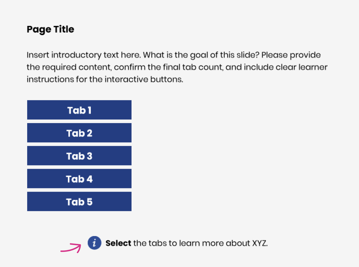
1. Set the Stage (Background & Branding)
First, I start with a high-contrast background colour. This isn't just an aesthetic choice; it makes the text pop and reduces eye strain. I’ve included placeholder text for the title and introduction—you can easily swap these out and update the fonts to match your organisation’s brand guidelines.
2. Don’t Forget the "How-To"
I always include an instruction note for the learner.
💡Design Tip: Go to Insert > Icons and search for "info" to find a graphic that supports your instruction text. It’s a small visual cue that makes the UI more intuitive.
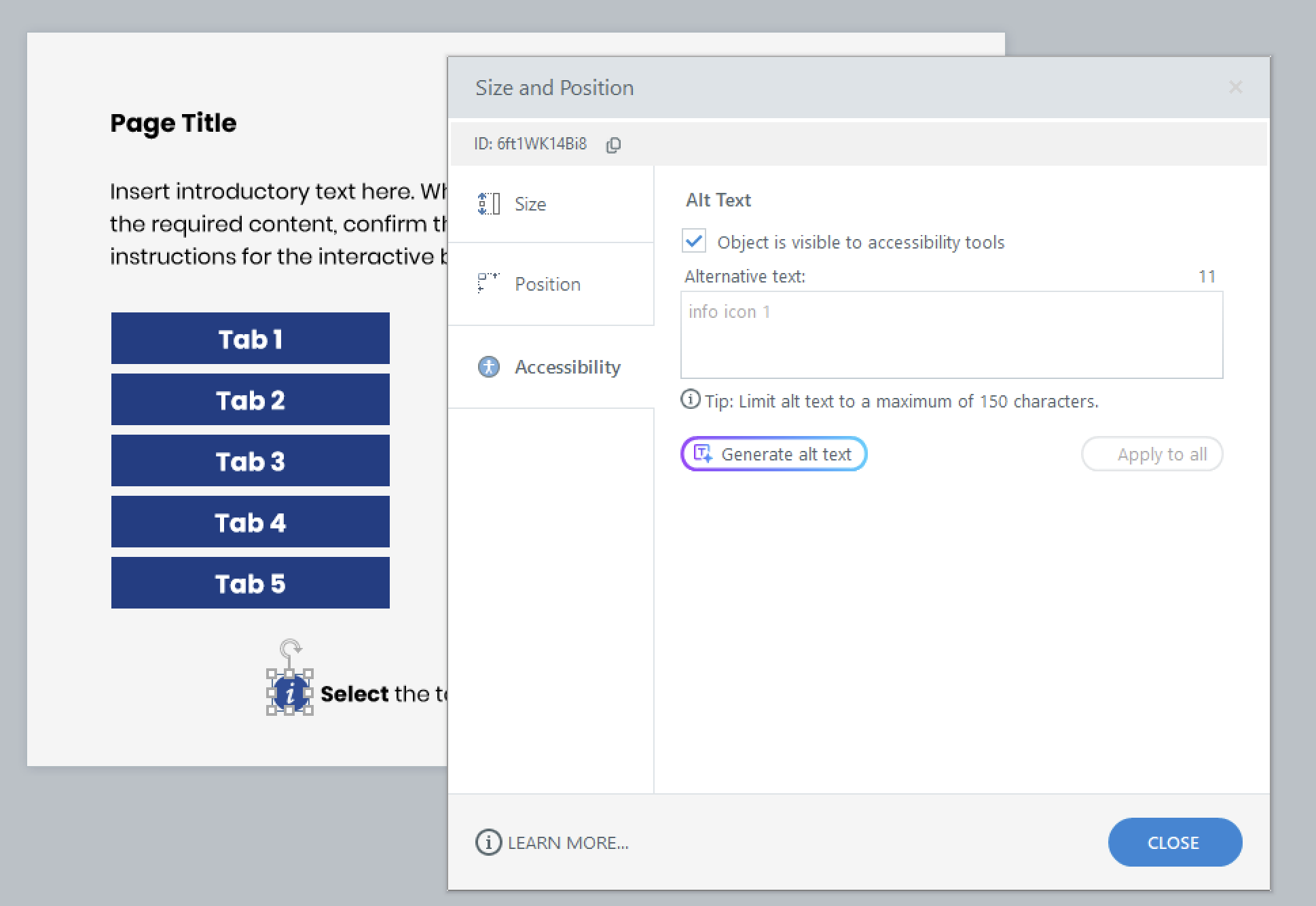
3. A Quick Pro-Tip for Accessibility
If you use a decorative icon (like the info circle), remember to right-click the icon, select Accessibility, and untick "Object is visible to accessibility tools." This prevents screen readers from announcing unnecessary decorative elements, making the experience much smoother for learners using assistive technology.
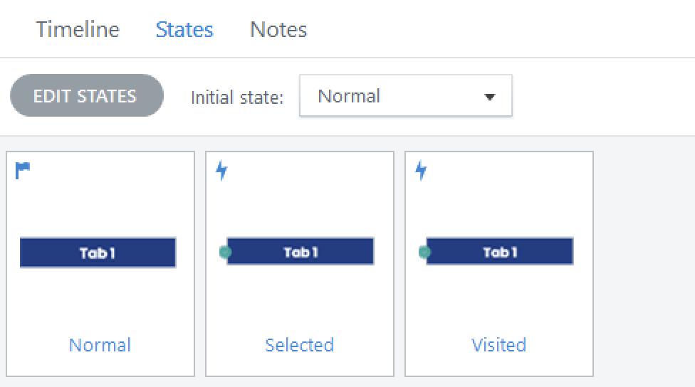
4. Building Smarter Buttons
The heart of this interaction lies in the States. My custom tabs include:
Normal: The default look.
Selected: To show which tab is currently open.
Visited: This state features a checkmark icon (from the Storyline library) to visually signal to the learner that they’ve already completed that section.
5. Organisation is Key
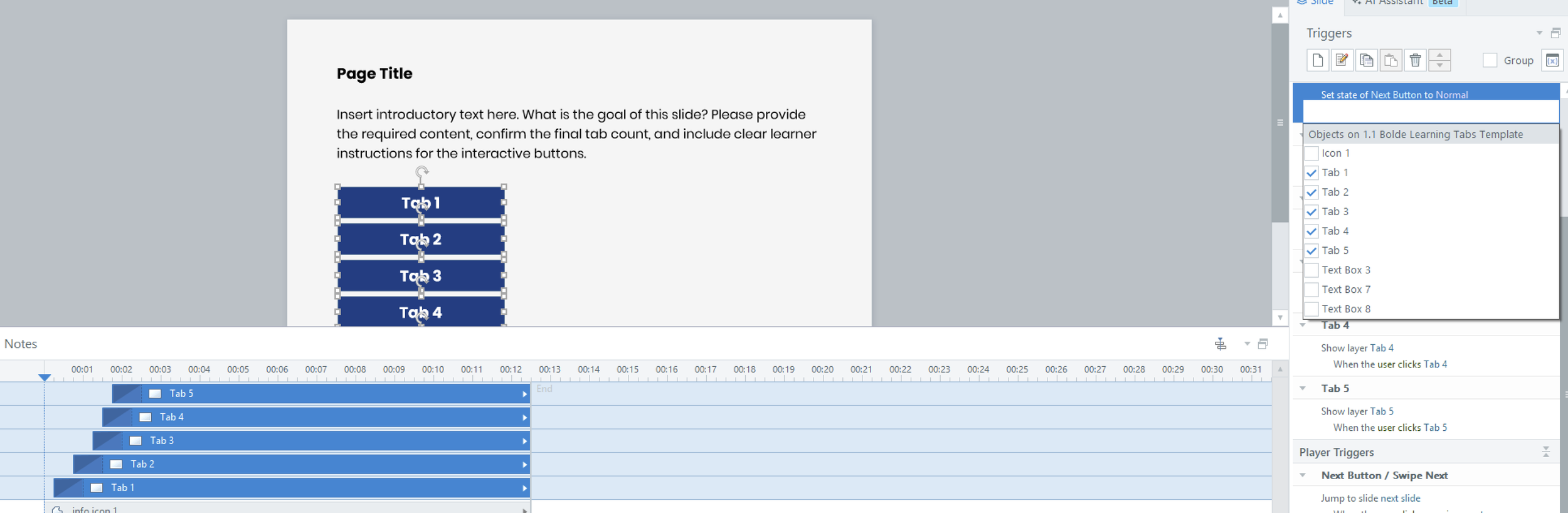
If you look at my Timeline, you’ll notice that I’ve named the objects exactly the same as my Layers. This might seem like extra work, but it makes setting up your triggers 10x faster and prevents "trigger-confusion" later on.
Each layer features a clean white box for readability and an animated rectangle that slides into place, giving the illusion of a moving tab for a more premium, "app-like" feel.
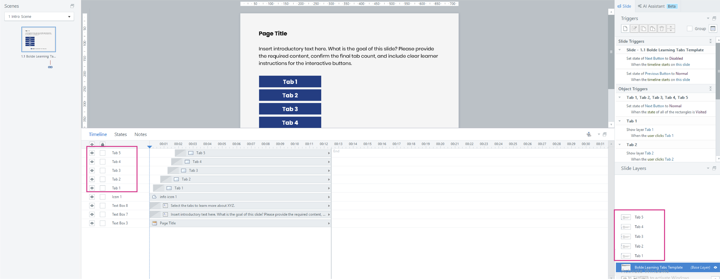
6. Setting the Triggers
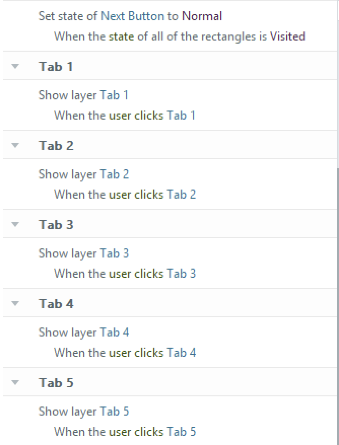
The logic here is simple but effective:
Show Layer: Use a basic trigger to show "Tab 1" when the user clicks the "Tab 1" button.
Navigation Locking: Want to ensure the learner interacts with everything before moving on? Here is the secret sauce:
Set the Next Button to Disabled when the timeline starts on this slide.
Create a trigger to Change State of the Next Button to Normal once the state of all tabs (1–5) are Visited.
💡 This is why setting up that "Visited" state early is so important—it’s not just for visuals; it’s the engine that drives your navigation logic!
7. Test & Publish
Once you’ve customised the layout, take a moment to Preview the slide and ensure the triggers are firing exactly as planned. If everything looks sharp, you're ready to publish!
I hope this template saves you time on your next project. If there is a specific interaction or layout you’d like to see me build next, feel free to reach out—I’d love to hear your ideas.